
New signs for a new brand identity
Three Southwest Michigan hospitals (Oakwood, Botsford, and Beaumont) merged to become Beaumont Health. As a result, all exterior signage on every hospital campus, outpatient location, and independent physician's office needed to be updated with the new logo and primary blue color.
Beaumont approached Hyde Creative to generate a basic wayfinding strategy and design system that could quickly be implemented system-wide. For a project of this scale, we partnered with Visualhero to accomplish the discovery and strategic phases—analyzing the variety of sign types and locations to determine the best approach fitting for the initial launch of the new brand.
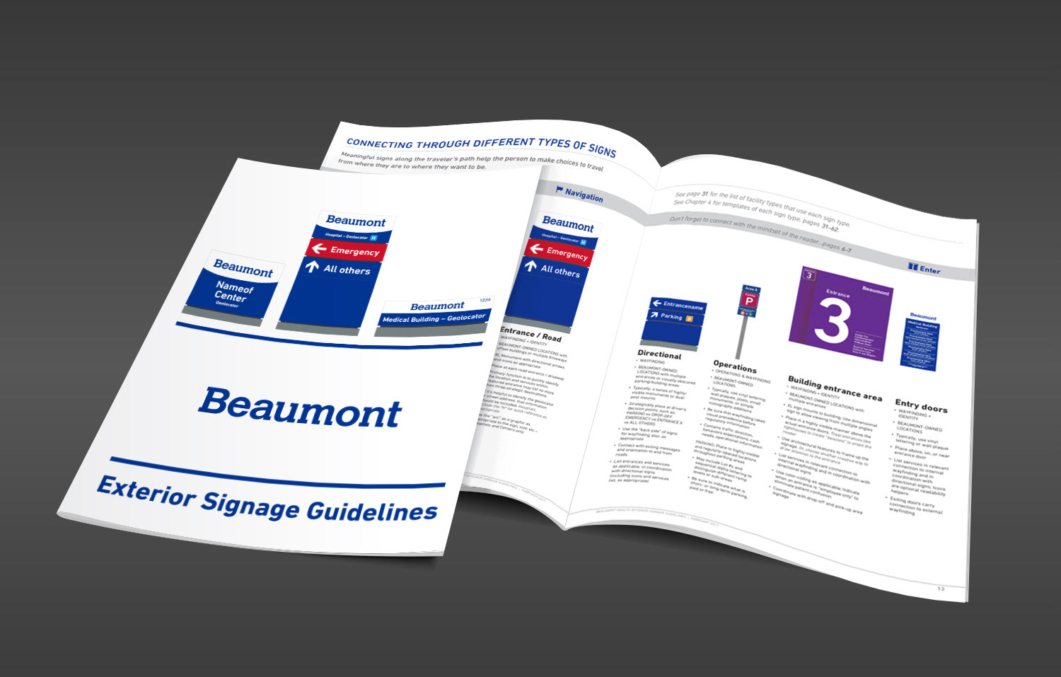
We built empathy with the users and identified a basic wayfinding strategy with 7 basic sign types that guide the user from arrival to building entrance.
To help facility managers build clarity and consistency across the brand, we identified and defined the message types and priorities of content to serve as the "building blocks" for each sign type. We also developed basic guardrails for naming locations and services, including definitions for 6 different types of facilities.
To ensure ease of execution, we developed a simple design system that could be later stylized, when the brand work would be completed. The system included guardrails on use of the logo, color, suggested typography, and iconography. With attention to both vertical and horizontal layouts, we then built out several example templates for 6 different location types.
Through stakeholder interviews and alignment, we pulled all these recommendations together in a 72-page book that facility managers, sign makers, and marketing could use as the single go-to source for answers on questions dealing with the "simple" request: Would you please make me a sign?
As a follow-up project, we also built a system for Beaumont's Physician Affiliated Sign Program. This system needed to work with the Beaumont exterior sign guidelines, yet needed to remain separate to quickly and clearly indicate the brand's relationship to each unique location. These signs could appear anywhere within leased spaces. The need for flexibility is paramount to building a successful program.
The result is a shorter, 30-page document outlining the basic design recommendations with color and typography guidelines, as well as tips for prioritizing content. Before-and-after examples were also included as reference. In an environment with myriad variables – from the construction style, materials, and size, to the complexity of services and number of physicians within each location – it's been an important piece of the new Beaumont brand's development.
The sign out front is often the primary expression of the nature of the care a patient received once they've entered the building. It is important to get the wayfinding, design, and messaging right.
Please contact us to request additional sample pages of these documents.
72-page guide outlining the Exterior sign system, messaging content, design strategies, as well as sign templates for Beaumont Health's hospitals, centers, and outpatient locations.