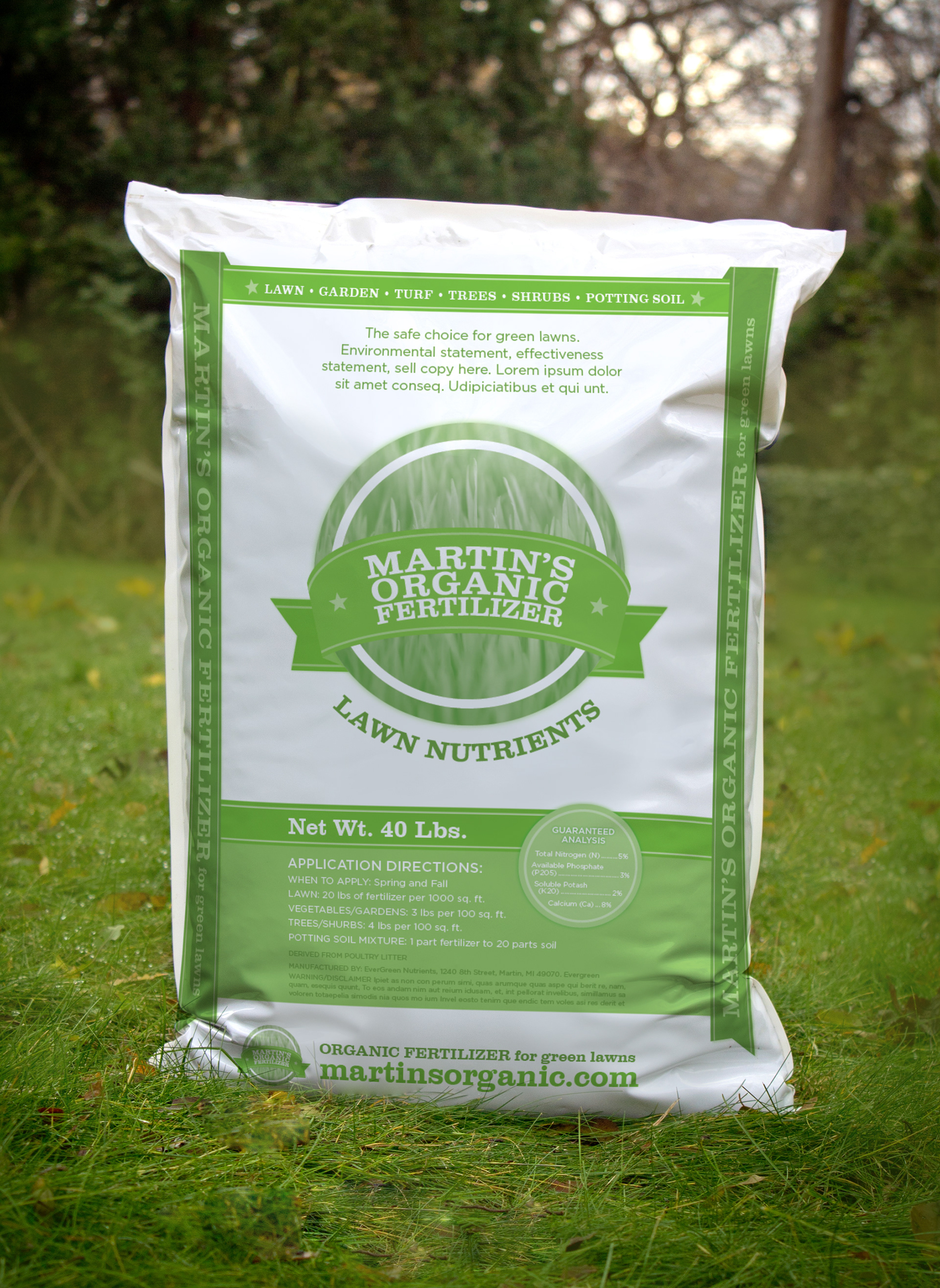
CONCEPT STATEMENT
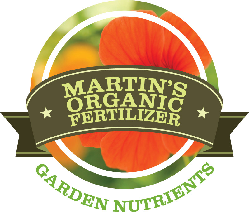
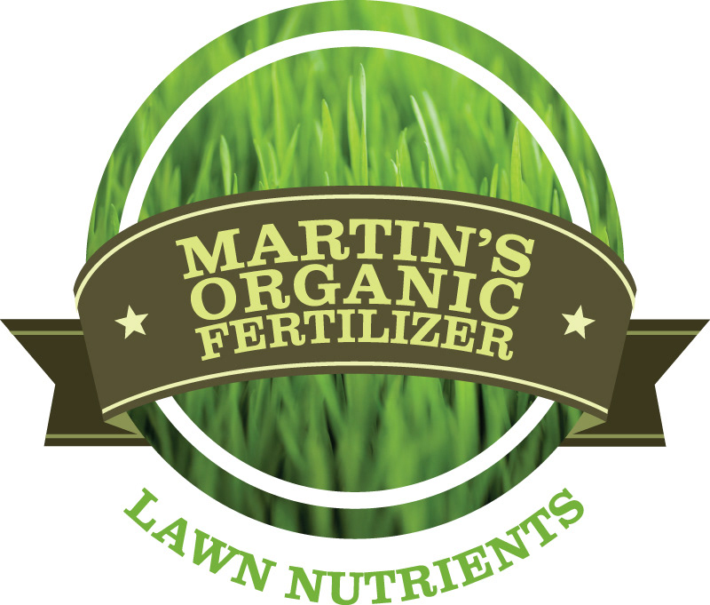
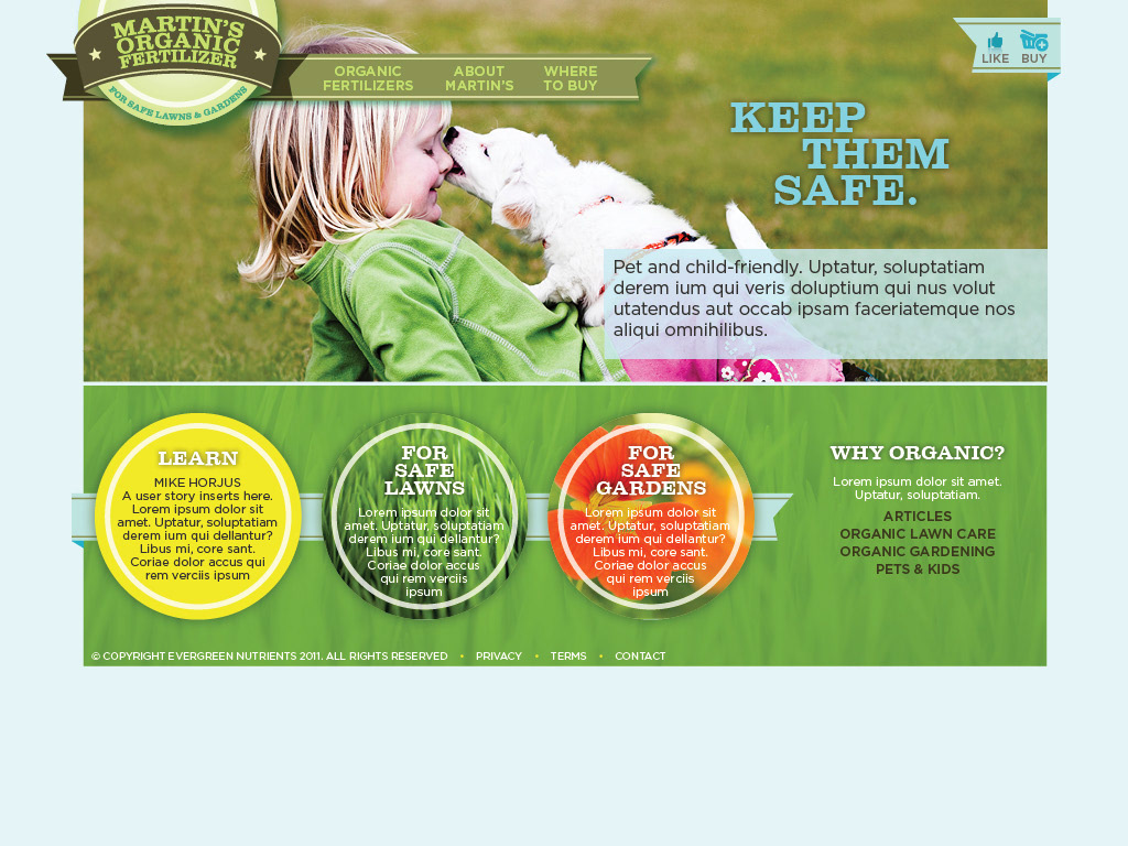
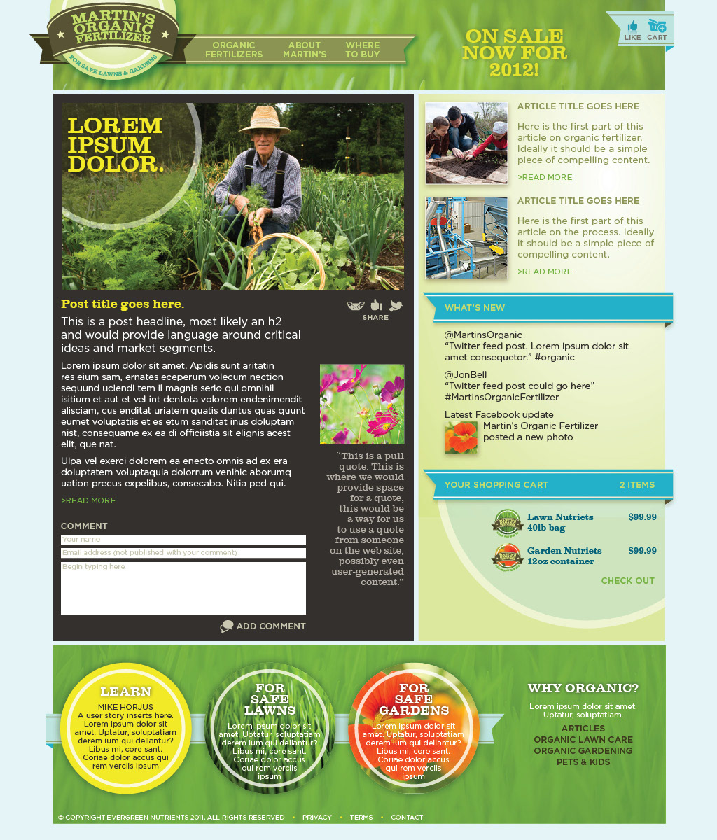
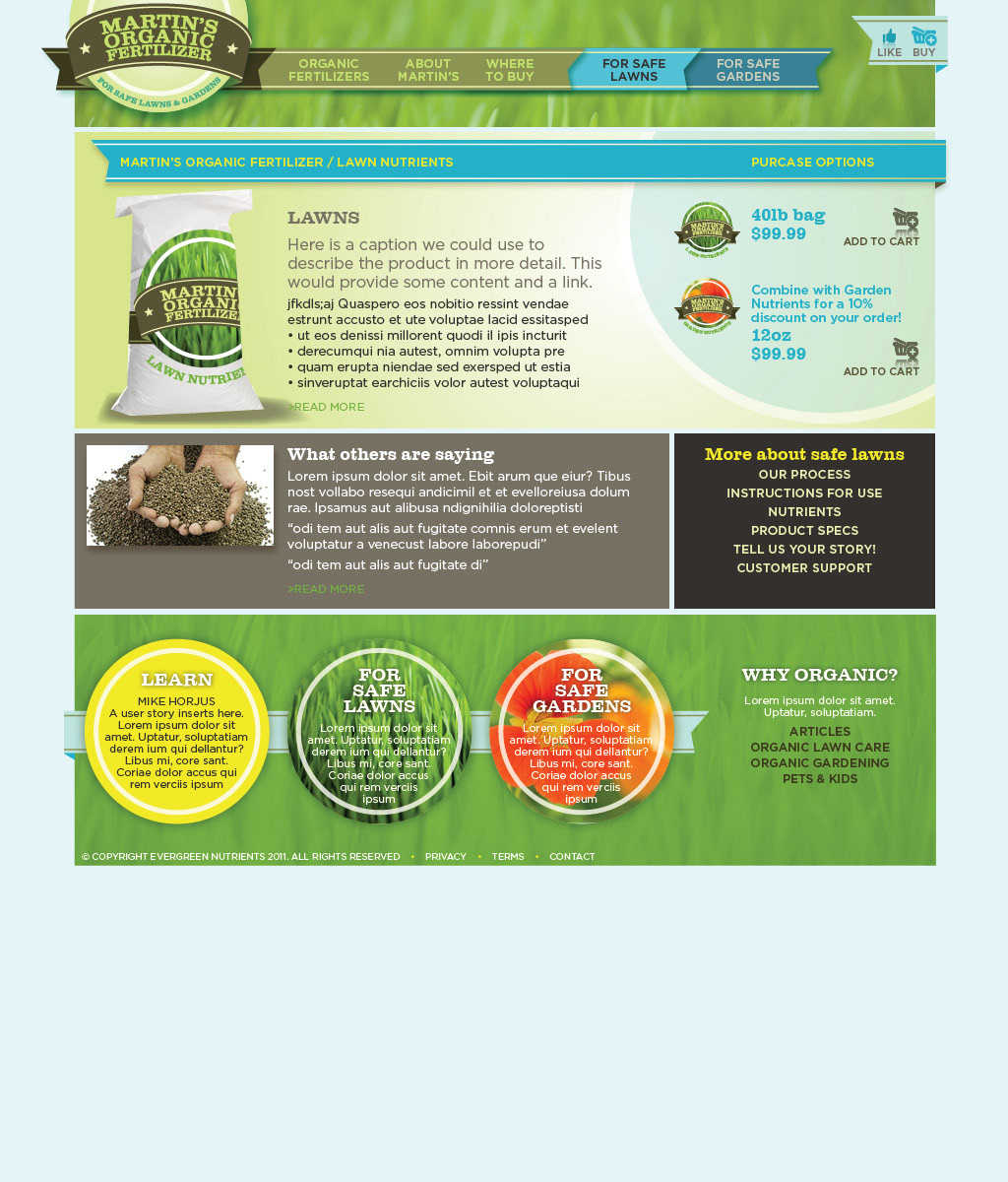
Martin's is a unique new product launched in 2012. This new Michigan fertilizer needed a name and look to stand out attract the organic market shopper. The result is a vibrant, earthy, rich website design that reflects the lively nature of the product logos.
"Martin's Organic Fertilizer" is a fresh take on an old school approach. This name involves the community that this fertilizer comes from, honors the people who work at the company, and the honest nature of this product. There are no smoke and mirrors at Martin's, no fancy word amalgamations, just pure products produced by hard working individuals. The target market for the organic fertilizer will appreciate this straightforward approach. They are used to being marketed to and constantly check the back ingredient label to see if that marketing is actually true. Martin's is a helpful reminder that there are still companies producing honest products just like they used to decades ago.
The word “Martin” can symbolize many things. Because the town of Martin is a relatively small community and not particularly well known, the word “Martin” isn’t necessarily tied to the community. In addition, the word could originate from a variety of things - someone’s name, a city, etc. In this case, we’re paying homage to the town of Martin, to the chickens that reside there, and to the original nature of the product.