Re-branding Access of West Michigan
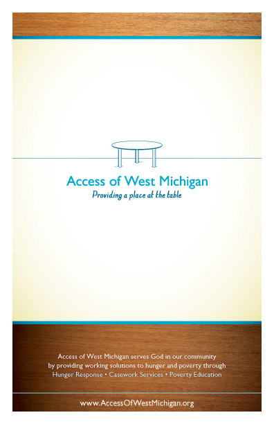
Providing a place at the table for working solutions to hunger and poverty
Providing a place at the table for working solutions to hunger and poverty
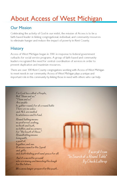
Access of West Michigan was ready to take their marketing materials to another level, corresponding with their re-focused approach to the services they provide. Their previous identity was centered around the idea of being a network, linking people and services within the community. On further discovery, Access really does so much more than that. With Poverty Education workshops and casework services, conversations with churches and supportive organizations, Access really is an organization that enables others to thrive.
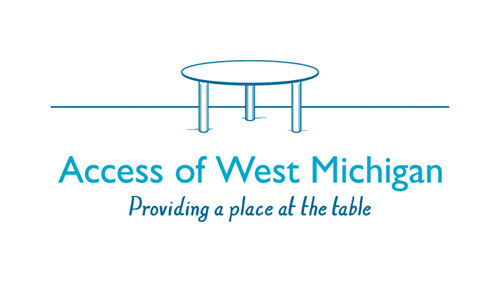
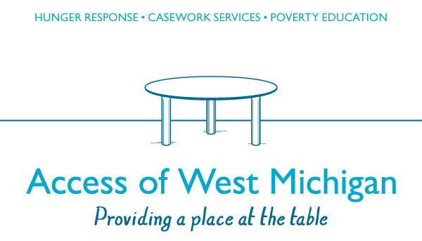
The new tagline "providing a place at the table" now reflects the open-ended and expansive nature of their work, and invites more passionate people to join in their efforts to address hunger and poverty in effective and respectful ways.
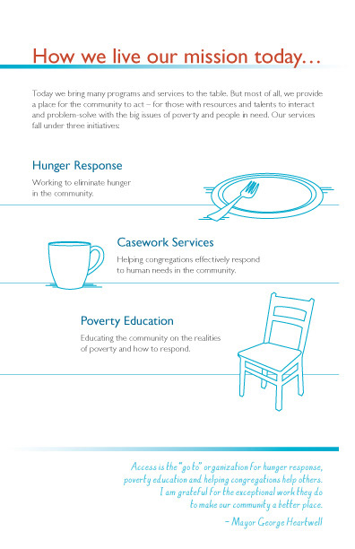
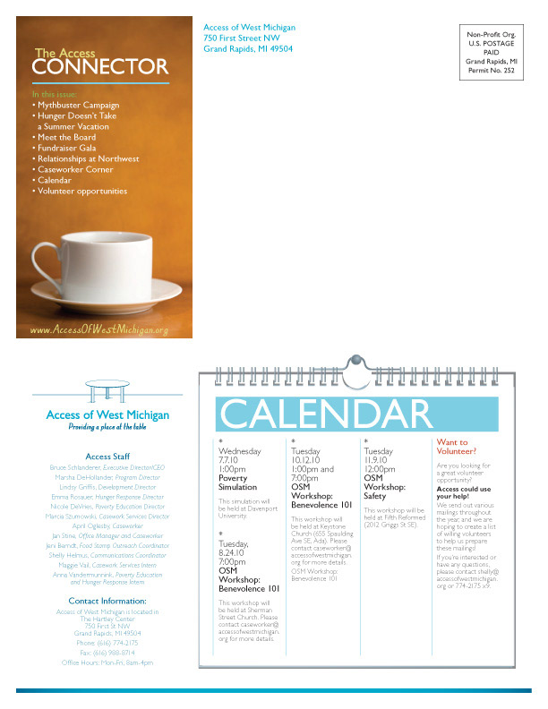
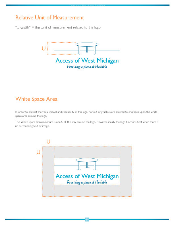
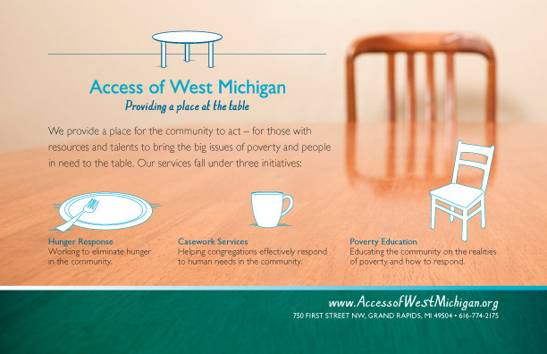
The new logo and icon also reflect this conversational yet professional nature. The table represents bringing food to the table, eating together at the table, gathering at the round table, hosting difficult conversations, putting words into action, pulling up new chairs, allowing access to everyone, and on ad n on. Each of their three initiatives also received a new icon to energize and support this theme.
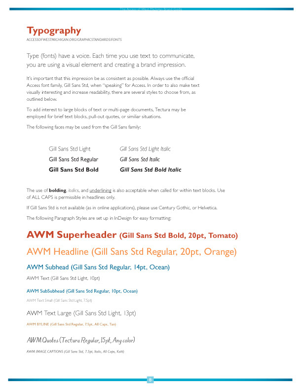
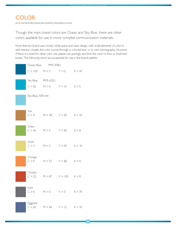
The new look also needed to be simple and easy to work with, enabling their already busy staff to create the best communication tools possible.
Deliverables included: Logo and identity suite, graphic standards manual, overview brochure, resource booklet, newsletter template (both electronic and printed/mailed), website images, twitter skin, advertising, and donor/volunteer/partner thank-you cards.
Having been connected with this organization over the last 15 years, it was an honor to work with the talented staff and board to energize the organization and encourage growth.
The new tagline "providing a place at the table" now reflects the open-ended and expansive nature of their work, and invites more passionate people to join in their efforts to address hunger and poverty in effective and respectful ways.
The new logo and icon also reflect this conversational yet professional nature. The table represents bringing food to the table, eating together at the table, gathering at the round table, hosting difficult conversations, putting words into action, pulling up new chairs, allowing access to everyone, and on ad n on. Each of their three initiatives also received a new icon to energize and support this theme.
The new look also needed to be simple and easy to work with, enabling their already busy staff to create the best communication tools possible.
Deliverables included: Logo and identity suite, graphic standards manual, overview brochure, resource booklet, newsletter template (both electronic and printed/mailed), website images, twitter skin, advertising, and donor/volunteer/partner thank-you cards.
Having been connected with this organization over the last 15 years, it was an honor to work with the talented staff and board to energize the organization and encourage growth.
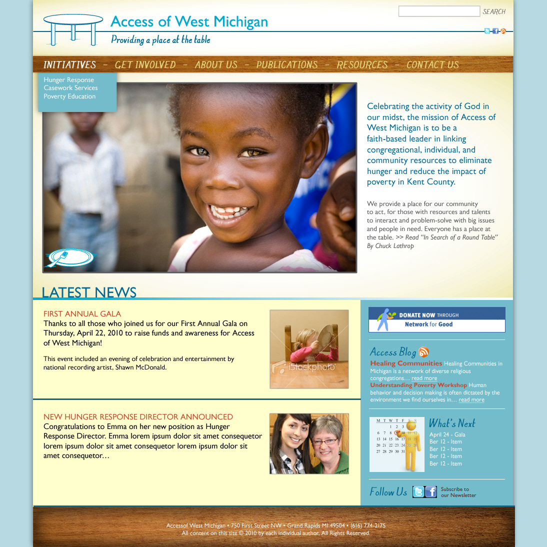
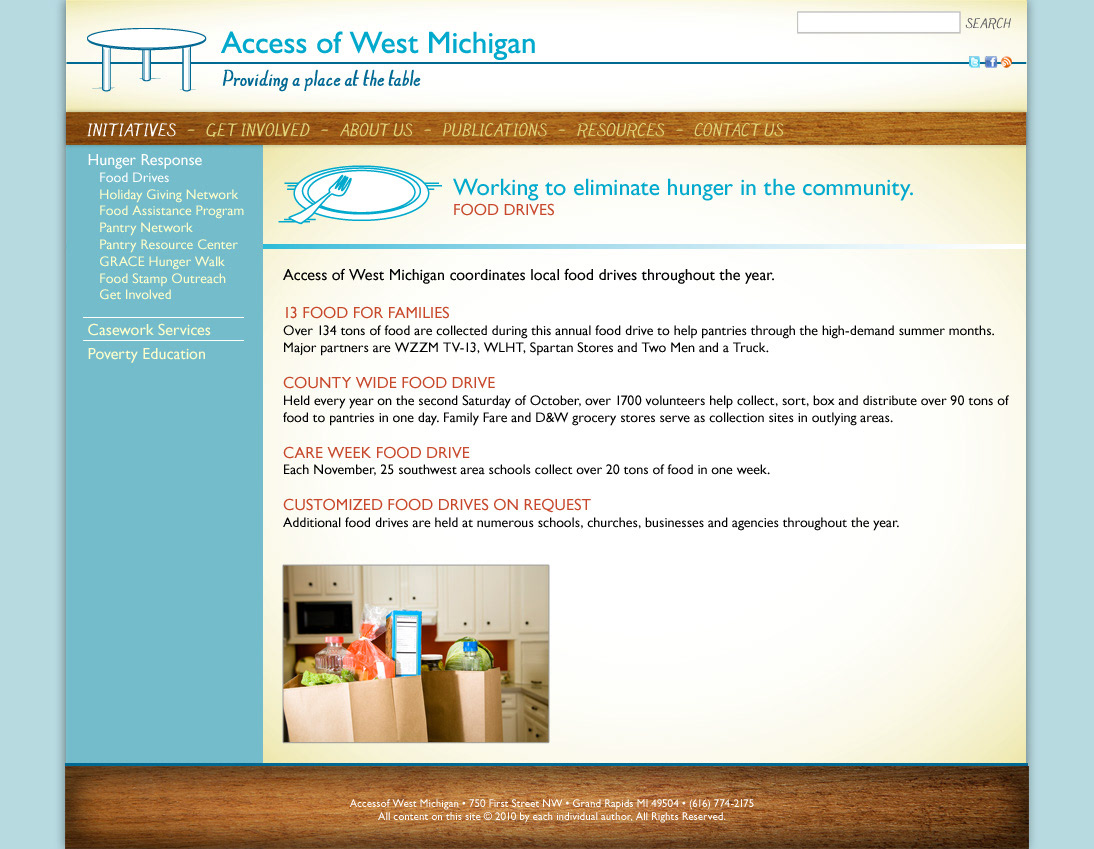
Website full re-design


Overview Brochure
Newsletter
Identity Suite
business card front
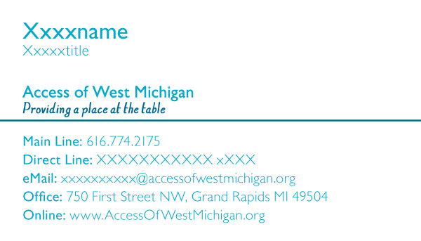
business card back
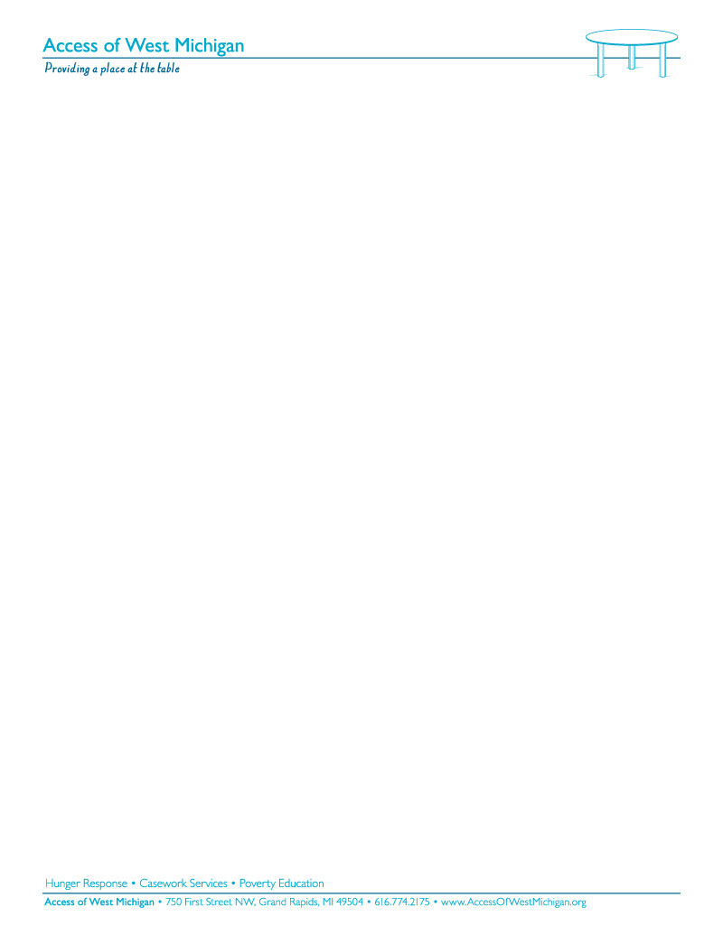
letterhead

envelope
Graphic Standards
Additional Materials
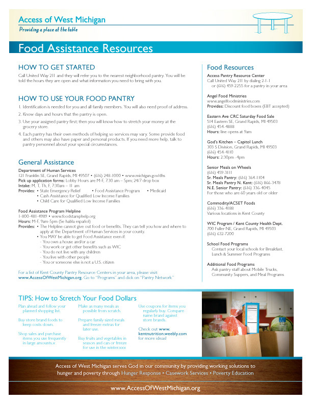
resource cut sheets
print ad
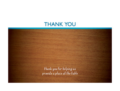
donor/volunteer/partner thank-you card
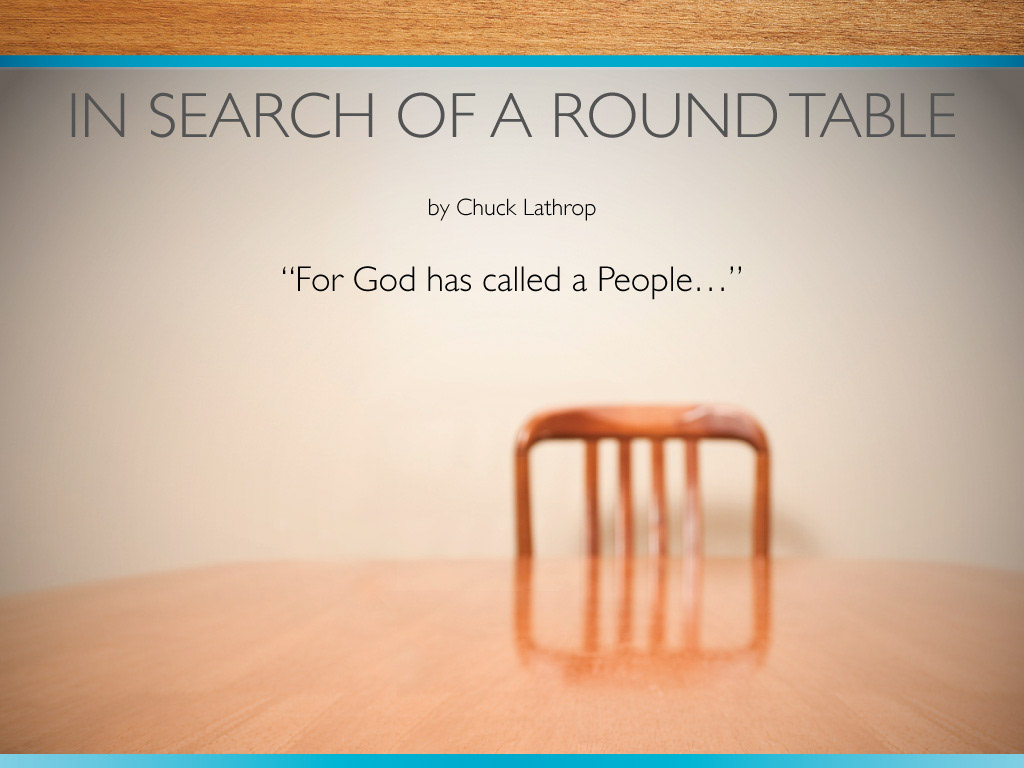
introductory PowerPoint presentation

social media/Twitter icon
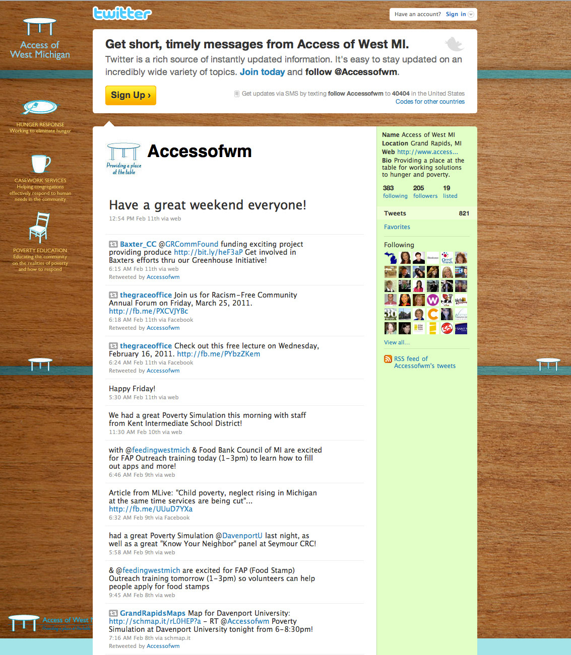
twitter skin